
Testimony
before the
Senate
Committee on Banking,
Housing and
Urban Affairs
Reasonable Expectations for
Transit in the Modern Urban
Area
8 October 2002
Wendell Cox
Visiting Fellow
The Heritage Foundation
&
Principal,
Wendell Cox Consultancy
Reasonable
Expectations for
Transit in the Modern
Urban Area
Testimony by Wendell
Cox
Before the
Senate Committee on Banking,
Housing and Urban Affairs
Senate Banking, Housing & Urban Affairs Committee Hearing Notice
Mr. Chairman and Members of the Committee:
Thank you for inviting me to testify today.
My name is Wendell Cox. I am an independent consultant
headquartered in Belleville, Illinois,
in the St. Louis area. I am also a
visiting fellow at The Heritage Foundation. I must stress, however, that the
views I express are entirely my own, and should not be construed as
representing the position of The Heritage Foundation.
I was appointed to three terms on the Los Angeles Country
Transportation Commission by Mayor Tom Bradley and was appointed to the Amtrak
Reform Council by Speaker Gingrich. Earlier this year I served an assignment as
a visiting professor at the Conservatoire National des Arts ET Metiers (CNAM),
a French national university in Paris,
conducting seminars and research on urban planning and transport.
I will share perspectives that you may not have heard before
--- about how transit has little or no potential to address traffic congestion
and how so-called “smart growth” promises to worsen traffic congestion while
making housing less affordable especially for the nation’s lower income
households who are disproportionately minority. These views are held by other
professionals and academics as well, and they challenge what is considered to
be the conventional wisdom in both transport and urban planning. I will, of
course, be pleased to supply the Committee with additional details as
requested.
Increasing Traffic
Congestion, Declining Transit Market Share
It is painfully obvious to commuters in virtually all US
urban areas that traffic is getting worse. This has been going on for some
time, but has become much more critical in recent years. For example, the US
Census Bureau reports that average work trip travel time increased 3.1 minutes
nationally from 1990 to 2000, a rate four times that of 1980 to 1990. And,
things are likely to get much worse (Figure #1).
For some time there has been a widely held view that transit
has the potential to reduce urban traffic congestion. Indeed, that sentiment
was part of the rationale behind making highway user fees available to transit
in the 1982 reauthorization.
Yet, despite spending nearly $500 billion in subsidies at
the federal, state and local level since 1960, transit’s share of urban trips
has continued to trend downward. This is confirmed by the 2000 Census, which
shows that transit’s share of work trips has reached a new low --- 4.6 percent
(Figure #2), down more than 10 percent from 1990 (Table #1). While employment
was increasing 13.2 million, transit work trip use declined nearly 23,000. Only
two metropolitan areas with more than 1,000,000 population maintain a transit
work trip market share of more than 10 percent (Table A-1).
|
Table #1
Work Trip Market Share by Mode: 1990 & 2000
|
|
Mode
|
1990
|
Share
|
2000
|
Share
|
Change
|
Change in Share
|
|
Car, Truck or Van
|
99,592,932
|
86.5%
|
112,736,101
|
87.9%
|
13,143,169
|
1.5%
|
|
Drove Alone
|
84,215,298
|
73.2%
|
97,102,050
|
75.7%
|
12,886,752
|
3.4%
|
|
Car Pool
|
15,377,634
|
13.4%
|
15,634,051
|
12.2%
|
256,417
|
-8.8%
|
|
Public Transit*
|
6,069,589
|
5.3%
|
6,067,703
|
4.7%
|
(1,886)
|
-10.3%
|
|
Public Transit
|
5,890,155
|
5.1%
|
5,867,559
|
4.6%
|
(22,596)
|
-10.6%
|
|
Taxicab
|
179,434
|
0.2%
|
200,144
|
0.2%
|
20,710
|
0.1%
|
|
Motorcycle
|
237,404
|
0.2%
|
142,424
|
0.1%
|
(94,980)
|
-46.2%
|
|
Bicycle
|
466,856
|
0.4%
|
488,497
|
0.4%
|
21,641
|
-6.1%
|
|
Walk only
|
4,488,886
|
3.9%
|
3,758,982
|
2.9%
|
(729,904)
|
-24.9%
|
|
Other
|
808,582
|
0.7%
|
901,298
|
0.7%
|
92,716
|
-0.0%
|
|
Work at Home
|
3,406,025
|
3.0%
|
4,184,223
|
3.3%
|
778,198
|
10.2%
|
|
Workers 16 Years &
Over
|
115,070,274
|
100.0%
|
128,279,228
|
100.0%
|
13,208,954
|
0.0%
|
|
Source: Data from US
Census Bureau
*With Taxicab
|
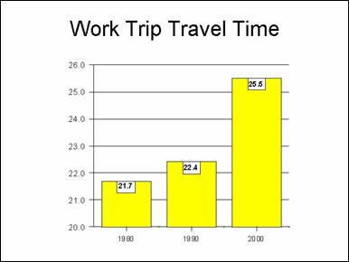
Figure 1
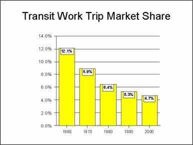
Figure 2
The Transit Dilemma:
Little Auto Competitive Service
This is not to suggest that transit does not play an
important role. Make no mistake about it --- where transit provides
auto-competitive service, people use it. To be auto-competitive, transit must
be, at a minimum, time competitive with the automobile. The 2000 Census data
indicates that transit work trips take considerably longer than auto work
trips. The average transit work trip was 43 minutes, which compares to other
modes (mainly auto) at 24.8 minutes. Transit work trips take longer than auto
trips in all metropolitan areas with more than 1,000,000 population (Table
A-2).
But where transit is auto-competitive, it is very
successful. For example:
- In the
Tokyo area, nearly 60 percent
of travel is on transit. Why? The reason is that transit is generally
faster than the automobile, with the dense network of urban rail services
and frequent connecting bus service making transit service attractive
throughout the urban area. This is illustrated by the fact that Tokyo,
with approximately 1.5 times the population of the New
York urban area, carries approximately 4.5 times
as many riders annually, and 60 percent more riders than all of the
transit systems in the United States
combined. Nonetheless, the automobile is making significant inroads in the
Tokyo area. In suburban areas,
where the auto is more competitive, transit market share is nearly 40
percent below that of the central city. And, throughout the area, transit
market share has fallen nearly 30 percent since 1970.
- In the
Paris area, 24 percent of
travel is by transit. There, the commuter rail and metro systems provide
generally faster travel than the automobile, with more than 60 percent of
central city oriented travel on transit. But the situation is much
different in the suburbs, where 80 percent of Parisians live and work.
There, only 15 percent of travel is on transit, because transit provides
little suburb to suburb service that is auto-competitive. As in Tokyo,
transit’s market share has fallen in the Paris
area, approximately 40 percent since 1970. The situation and experience in
Paris is typical of other
urban areas in Western Europe.
- In the
New York area, approximately
10 percent of travel is on public transit. Much of this travel is focused
in the city of New York, and
especially to the Manhattan central
business district (below 59th Street).
In 1990, approximately 75 percent of work trips to this area were on
transit. In fact, approximately 22 percent of the nation’s transit work
trips were to the Manhattancentral business district, an area of less than
10 square miles. Nearly 73 percent of work trips to locations within the
city of New York were on
transit, representing more than one-third of the nation’s transit work trips.
Yet, in the vast sprawling suburbs of New York,
only four percent of work trips were by transit. The difference is that
substantial levels of auto-competitive service is provided to Manhattan
and within the city of New York.
It is possible to provide auto-competitive service because of the city’s
high population and density, and the slower automobile operating speeds
that result from the intense traffic congestion. Other than travel in and
to the city, however, few trips can be made by auto-competitive transit.
- Transit
accounts for more than 50 percent of work trip travel to the Chicago
central business district, the nation’s second largest downtown. Again,
the key is auto-competitive service available to this concentrated area
from most locations in the urban area. Within the city itself, transit’s
work trip market share is nearly one-third. But in the suburbs, transit’s
work trip market share is barely three percent. Travel by transit from
suburban residence to suburban employment locations can average more than
two hours, in an urban area where automobile work trips average less than
30 minutes.
- In
most other major metropolitan areas, transit competitive service is
largely limited to downtown locations, and often only during peak
commuting hours. Outside the New York
and Chicago metropolitan
areas, overall transit market shares tend to be approximately one percent
(Figure #3)
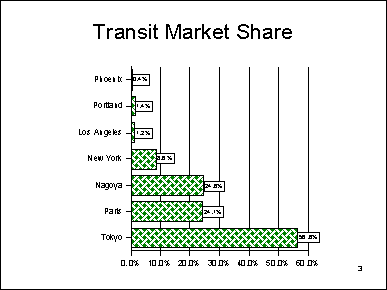
Figure 3
What all of this says is that transit is largely about downtown
and to a lesser degree a small number of urban cores (Figure #4). Overall, only
the New York and Chicago
metropolitan areas maintain a transit work trip market share of more than 10
percent, with most of that concentrated in the core areas. In fact, more than
one-half of the nations’ transit work trips are to locations within the central
cities of New York, Chicago
and the ten next largest central business districts. Thus, 3.1 million of the
nation’s transit work trips are to a gross area of less than 600 square miles,
while the balance of 2.8 million transit work trips are to the other more than
86,000 square miles of urbanized land. Thus, outside trips to downtown, transit
is able to make little or no difference with respect to traffic congestion.
In most major metropolitan areas, auto-competitive transit
service is limited to downtown service. This is illustrated by Portland
(Oregon), which has the nation’s
most aggressive smart growth policies and has nearly doubled transit service in
the last decade. Transit competitive service is provided from approximately 70
percent of the urban area to downtown (where transit competitive is defined as
1.5 times auto travel times). Outside downtown employment locations are
accessible to only five percent of the urban area by transit competitive
service. People are not going to forsake their cars for transit service that
takes too long, or transit service that doesn’t even exist.
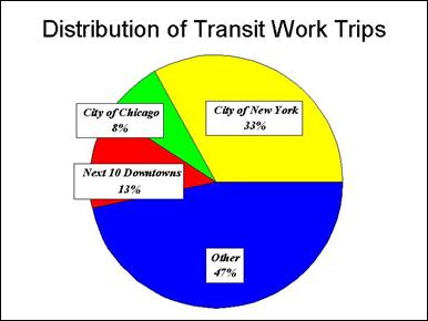
Figure 4
It is not surprising, therefore, that people who use transit
to non-downtown locations have much lower incomes than those able to access the
auto-competitive services to downtown. In 1990, downtown transit commuters had
an average household income within six percent of the national average.
Non-downtown transit commuters had an average household income 40 percent below
average. It would appear that transit is used for non-downtown work trips only
by those who don’t have a choice (those who have no automobile available).
The key to getting people out of their cars is to provide
automobile competitive service --- service that is competitive in travel time.
But, as noted above, there is little auto-competitive service in the United
States and little more planned to areas
other than downtowns. And, despite their vertical impressiveness, downtowns
represent a small and declining share of metropolitan employment in the United
States. In 1990, the average downtown area
accounted for barely 10 percent of metropolitan employment (Figure #5). Even Manhattan’s
central business district, the second largest in the world, accounted for
barely 20 percent of metropolitan New York’s
employment.
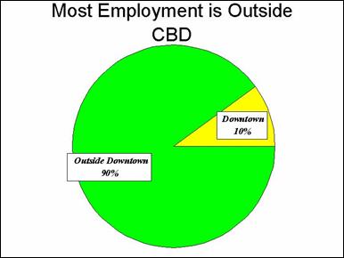
Figure 5
The Union of International Public Transport is hardly the
type of organization that would be expected to make critical comments about
public transit. But this organization, the international equivalent of the
American Public Transportation Association (APTA) put it this way:
In the United States, with the exception of New
York, public transport is unable to compete with the automobile: its speed is
half as fast, which means that door-to-door travel times, incorporating
terminal distance times, waiting and transfer times, are 3 to 4 times longer on
public transport.”
Actually, this is
something of an overstatement. Transit plays an indispensable role in providing
auto-competitive service to a few much focused areas of the nation. But outside
these areas, the potential for transit to attract people out of cars is nearly
non-existent.
This is illustrated by the record of metropolitan areas that
have built new rail systems.
- Between
1990 and 2000, Dallas opened a
commuter rail line and three branches of a light rail system. Yet, overall
transit work trip ridership decreased (Table #2).
- Between
1990 and 2000, St. Louis
opened a new light rail line. Yet, transit work trip ridership decreased
(Table #3).
- Between
1970 and 2000, Washington
opened approximately 100 miles of its Metro system. Yet, transit’s work
trip market share dropped 29 percent.
- Transit’s
work trip market share continues to trail pre-light rail levels in Portland,
though minor gains were made in the 1990s. Street and highway traffic has
grown faster than transit use since 1985, the year before the first of two
light rail lines was opened. Traffic delays, as measured by the Travel
Time Index have grown 31 percent, the second largest increase in the
nation (Figure #6).
The problem is further illustrated by the case of
Minneapolis-St. Paul, which is currently building a light rail line (the
“Hiawatha Line”) and seeks to build a commuter rail line (the “Northstar
Line”). There, the Texas Transportation Institute estimates that it would take
an addition of 84,000 annual transit one-way
peak period riders just to stop to growth of traffic congestion. The two lines
would add fewer than 9,000 one-way transit riders over a period of 20 years or
more. During the 1990s, transit work trip use increased approximately 200
annually, a small fraction of what would be required to materially impact traffic
congestion (Figure #7).
Urban rail systems
are exceedingly expensive. Often the annual cost per commuter attracted from
the automobile exceeds the recurring lease cost for a new automobile.
|
Table #2
Work Trip Market Share in Dallas County: 1990-2000
|
|
Mode
|
1990
|
Market Share
|
2000
|
Market Share
|
Change
|
Change in Market Share
|
|
Drive Alone
|
718,709
|
76.2%
|
777,372
|
74.8%
|
58,663
|
-1.8%
|
|
Car Pool
|
135,776
|
14.4%
|
167,270
|
16.1%
|
31,494
|
11.9%
|
|
Transit
|
38,150
|
4.0%
|
35,261
|
3.4%
|
(2,889)
|
-16.1%
|
|
Walk
|
19,027
|
2.0%
|
17,390
|
1.7%
|
(1,637)
|
-17.0%
|
|
Other
|
11,004
|
1.2%
|
13,108
|
1.3%
|
2,104
|
8.2%
|
|
Work at Home
|
20,480
|
2.2%
|
28,378
|
2.7%
|
7,898
|
25.8%
|
|
Total
|
943,146
|
100.0%
|
1,038,779
|
100.0%
|
95,633
|
0.0%
|
|
Taxicab included in "Other"
Calculated from US Census Bureau data.
|
|
Table #3
Work Trip Market Share in Metropolitan St. Louis: 1990-2000l
|
|
Mode
|
1990
|
Market Share
|
2000
|
Market Share
|
Change
|
Change in Market Share
|
|
Drive Alone
|
912,509
|
79.7%
|
1,023,627
|
82.6%
|
111,118
|
3.6%
|
|
Car Pool
|
137,883
|
12.0%
|
122,219
|
9.9%
|
(15,664)
|
-18.1%
|
|
Transit
|
31,355
|
2.7%
|
28,675
|
2.3%
|
(2,680)
|
-15.5%
|
|
Walk
|
24,556
|
2.1%
|
20,131
|
1.6%
|
(4,425)
|
-24.3%
|
|
Other
|
10,881
|
1.0%
|
9,020
|
0.7%
|
(1,861)
|
-23.4%
|
|
Work at Home
|
27,152
|
2.4%
|
35,292
|
2.8%
|
8,140
|
20.1%
|
|
Total
|
1,144,336
|
100.0%
|
1,238,964
|
100.0%
|
94,628
|
0.0%
|
|
Taxicab included in "Other"
Calculated from US Census Bureau data.
|
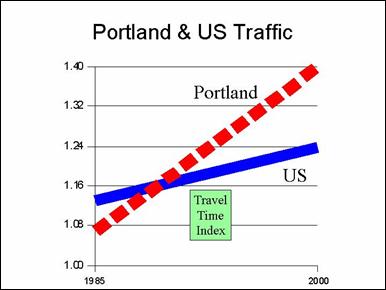
Figure 6
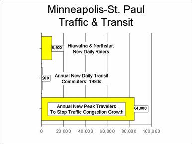
Figure 7
Funding Imbalance
The modest returns from the nation’s new urban rail systems
are evident when measured in terms of the cost per new passenger mile. From
1980 to 2000, incremental government expenditures (federal, state and local) on
transit were $1.19 per incremental passenger mile, nearly 40 times that of streets
and highways (Figure #8). And, while highway user fees and special imposts
accounted for 75 percent or more of highway expenditures, transit user fees
accounted for less than 30 percent of expenditures.
This spending imbalance is even more significant in some of
the nation’s major urban areas. For example, through 2025, the Atlanta
region will spend 55 percent of its transportation resources on public transit,
while transit’s share of trips is expected to grow from only 2.6 percent to 3.4
percent (Figure #9).
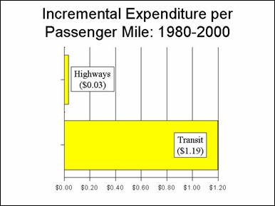
Figure 8
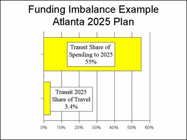
Figure 9
The defining factor with respect to urban transport is that
virtually all new travel demand is expected to be automobile related. Even Portland’s
land use-transport planning agency, Metro, acknowledges this (Figure #10). The
fundamental problem is that there is no transit system that can provide
auto-competitive service to a significant share of destinations outside
downtowns. This is true not only in the United
States, and to a somewhat lesser degree even
in Western Europe. Our research indicates that a transit
system that provides auto-competitive service throughout the modern American
urban area could cost as much as a metropolitan areas’ gross regional product.
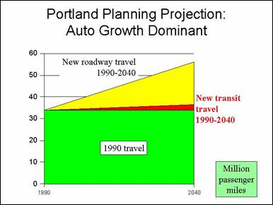
Figure 10
But this does not mean that there is not a cost efficient
role for strategies other than the single occupant automobile. The recent
Census data indicates rays of hope. While overall transit work trip ridership
was declining slightly, progress was made in much less costly modes, namely
working at home (telecommuting) and car pooling. . Working at home increased
778,000 and car pooling increased 256,000, though registering a 3.4 percent
market share loss (Figure #11).
- In
eight metropolitan areas, telecommuting increased more than 25,000. In
each of these areas, the increase was greater than that of transit (Table
#4). Telecommuting increased more than transit in 40 of the nation’s 49
metropolitan areas over 1,000,000, and increased 19 times as much as
transit (Table A-3). Little, if any government subsidy has been used to
encourage telecommuting.
- In 11
metropolitan areas, car pooling increased more than 25,000. Again, in each
such area, the increase was greater than that of transit (Table #5). In
both Atlanta and Dallas-Fort
Worth, which have made major urban rail investments, the 1990s increase in
car pooling alone exceeded the total
transit work trip ridership. Car pooling increased more than transit
in 36 of the nation’s 49 metropolitan areas over 1,000,000 and increased
16 times as much as transit (Table A-3). Some of the metropolitan areas,
such as Atlanta, Phoenix,
Dallas-Fort Worth, Seattle and
Houston employed aggressive
high occupancy vehicle (HOV) lane programs during the 1990s. Regional HOV
lane systems can provide opportunities for improved mobility to the entire
area, not just to downtown. Further, they can and are being used by
transit agencies to provide comparatively low cost express bus services.
The concept can be expanded even further through use of HOT lanes (high
occupancy toll lanes), which permit single occupant vehicles to use HOV
lanes for a price, which can be used to expand the system even further.
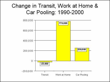
Figure 11
|
Table #4
Telecommuting and Transit Work Trip Trend: 1990-2000
|
|
Metropolitan Area
|
Transit Change
|
Telecommuting Change
|
|
New York--Northern New Jersey--Long Island,
NY--NJ--CT--PA CMSA
|
41,472
|
74,500
|
|
Los Angeles--Riverside--Orange County, CA CMSA
|
3,299
|
55,349
|
|
Chicago--Gary--Kenosha, IL--IN--WI CMSA
|
(42,131)
|
40,839
|
|
Atlanta, GA MSA
|
3,286
|
38,742
|
|
Boston--Worcester—Lawrence, MA--NH--ME--CT CMSA
|
29,223
|
33,125
|
|
Dallas--Fort Worth, TX CMSA
|
(567)
|
30,284
|
|
San Francisco--Oakland--San Jose, CA CMSA
|
27,049
|
27,915
|
|
Denver--Boulder--Greeley, CO CMSA
|
17,066
|
25,470
|
|
Total
|
78,697
|
326,224
|
|
Calculated from US
Census data.
|
|
Table #5
Car Pooling and Transit Work Trip Trend: 1990-2000
|
|
Metropolitan Area
|
Transit Change
|
Car Pooling Change
|
|
Atlanta, GA MSA
|
3,286
|
92,022
|
|
Phoenix--Mesa, AZ MSA
|
8,116
|
81,827
|
|
Dallas--Fort Worth, TX CMSA
|
(567)
|
79,603
|
|
Seattle—Tacoma--Bremerton, WA CMSA
|
28,611
|
49,573
|
|
Las Vegas, NV--AZ MSA
|
20,940
|
48,561
|
|
Houston--Galveston--Brazoria, TX CMSA
|
1,643
|
40,049
|
|
Austin--San Marcos, TX MSA
|
3,313
|
32,889
|
|
San Francisco--Oakland--San Jose, CA CMSA
|
27,049
|
28,035
|
|
Denver--Boulder--Greeley, CO CMSA
|
17,066
|
27,499
|
|
Raleigh--Durham--Chapel Hill, NC MSA
|
1,985
|
26,728
|
|
Portland—Salem, OR--WA CMSA
|
22,152
|
25,947
|
|
Total
|
133,594
|
532,733
|
|
Calculated from US
Census data.
|
One of the most promising developments has been the
recognition by the Federal Transit Administration and some transit agencies of
the much more cost effective options for rapid transit using buses. USDOT
research has indicated that bus rapid transit can be five times as cost
efficient per passenger mile.
Smart Growth: More
Traffic Congestion, Less Housing Affordability
The “Smart Growth” movement seeks to stop or control urban
sprawl. Proponents claim that it will reduce traffic congestion, reduce air pollution
and reduce costs. As a result, there are proposals to impose land use
regulations for controlling urban sprawl as in the federal transportation
program. It is fundamental that smart growth and containing sprawl require
higher densities. Smart growth’s goals simply are unattainable without much
higher densities.
US urban areas tend to be
less densely populated than those in Western Europe and Japan
(Figure #12). But, contrary to the popular view, sprawl is not an American
phenomenon. Sprawl occurs wherever there is population growth and rising
affluence, and European urban areas have seen their urban densities decline at
an even greater rate than in the United States
(Figure #13).
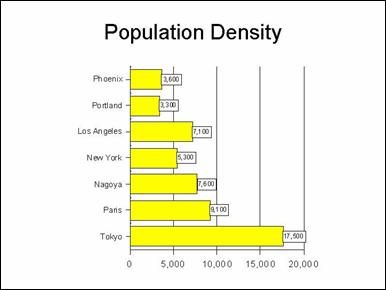
Figure 12
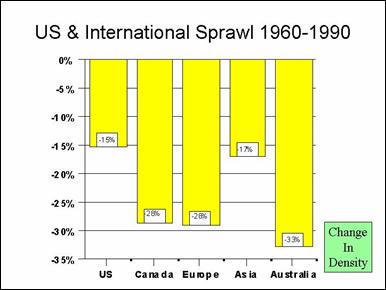
Figure 13
I do not favor sprawl. I favor allowing people to live and
work where and how they like. And, there is no reason not to allow it. Even
today, nearly 400 years after Jamestown,
urbanization accounts for less only 2.6 percent of the nation’s land area.
The claims of the smart growth movement simply do not hold
up.
National and international data clearly indicates that
traffic congestion rises with population density. The higher density European
and Asia urban areas, with their much higher public
transit market shares also have much worse traffic (Figure #14). Research
commissioned by the United States Department of Transportation indicates that
at current US
urban densities, vehicle miles rise more than 80 percent when population
density is doubled. Now, admittedly, that means that per capita driving
declines marginally, but it means that there are more miles in a defined area
--- traffic congestion is worse.
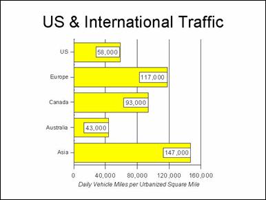
Figure 14
More driving per square mile means that traffic slows down
and that people must spend more time in their cars. Not surprisingly, journey
to work travel times tend to be longer where population densities are higher
--- whether in the United States
or internationally.
And, as traffic volumes in a particular area increase, there
is also an increase in stop and go driving. Slower speeds and stop and go
driving mean greater production of air pollution. So, not surprisingly, air
pollution production tends to be higher where densities are higher. And, it is
well to consider the great progress that has been made in air pollution
abatement in the United States.
In the last 30 years, driving has increased substantially, while criteria air
pollution production has decreased --- not
just per capita --- but overall.
So, smart growth increases traffic congestion, travel times
and air pollution.
Some months ago research was published showing that
transportation costs are higher in more sprawling areas. This is to be
expected. But what may be surprising is that overall household expenditures
tend to be lower where densities are lower. The big factor in this equation is
housing costs. Housing costs are less where densities are less, and they tend
to be less to such a great degree that the transportation cost disadvantage is
more than canceled.
But, the worst impact of all is social. Home ownership is
lower where densities are higher. Thus, smart growth works to make home
ownership more difficult for lower income households. Recent decades shows than
minority home ownership, (African-American and Hispanic), is rising faster than
that of non-Hispanic whites (Figure #15). At the same time, minority home
ownership levels still remain well below that of non-Hispanic whites, which is
why the Bush Administration has undertaken steps to more greatly expand
minority home ownership.
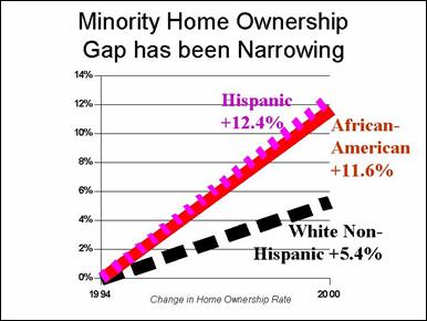
Figure 15
By raising the price of housing, smart growth promotes
social inequity. Smart growth rations land and development. It is a fundamental
principle of economics that when valuable goods are rationed, their prices
rise. When prices rise, it is the lower end of the income spectrum that is
driven away from the market. The lower income spectrum has a disproportionate
representation of minorities. As a result, smart growth reduces home ownership
opportunities for lower income households, especially African-Americans and
Hispanics. There is a raging debate between supporters and opponents of smart
growth about the extent to which home ownership is reduced by smart growth. We often
hear from smart growth supporters that they way to compensate for smart growths
reduction of home ownership is to provide greater amounts of affordable
housing. Such proposals are no more than empty platitudes in view of the fact
that, by some reports, current public resources are sufficient to provide
housing assistance to barely one third of eligible recipients. In fact, recent
research by Matthew Kahn of Tufts University
indicates that African-American home-ownership tends to be higher in more sprawling
urban areas (Figure #16). Further, research by Edward L. Glaeser and Joseph
Gyourko, published by Harvard University
found that much of the difference in housing affordability around the nation
can be attributed to land regulation.
It is not surprising that Oregon,
with the nation’s most comprehensive smart growth regulations, experienced by
far the greatest increase in housing values between 1990 and 2000 (Figure #17).
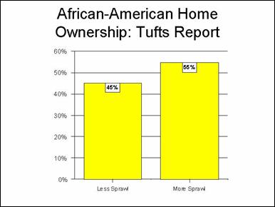
Figure 16
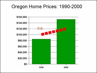
Figure 17
Thus, smart growth is promises to produce a more traffic
impacted urban area and one that is less economically inclusive. It would be a
mistake for the federal government to encourage such measures through the
transportation program.
RECOMMENDATIONS
Three conclusions
and three recommendations are suggested by the current situation and recent
trends in urban transport.
- The 1990 to 2000 Census data makes it
clear that telecommuting and car pooling options can be far more cost
effective than transit. The General Accounting Office should be asked to
review the potential for more effectively using new transit investment
funds to encourage additional telecommuting and car pooling.
- There is little potential for reducing
traffic congestion or increasing transportation choice for all but a few
through transit. There are no
material successes, US or international. The nation should move toward a
surface transportation program in which new investments are based upon a
policy goal that all can identify with --- the reduction of actual travel
times. Generally, new investments should be made based upon their cost per
reduced hour of actual travel delay.
- Smart growth strategies tend to
intensify the very problems they are purported to solve, especially by
increasing traffic congestion. There should be no federal mandates with
respect to land use or smart growth.
|
Table A-1
Transit Journey to Work Market Share: Major Metropolitan Areas
over 1,000,000: 1990-2000
|
|
Metropolitan Area
|
2000
|
1990
|
Change
|
|
Atlanta, GA MSA
|
3.5%
|
4.6%
|
-24.6%
|
|
Austin--San Marcos, TX MSA
|
2.5%
|
3.2%
|
-21.9%
|
|
Boston--Worcester--Lawrence, MA--NH--ME--CT CMSA
|
8.8%
|
9.7%
|
-8.8%
|
|
Buffalo--Niagara Falls, NY MSA
|
3.3%
|
4.5%
|
-24.8%
|
|
Charlotte--Gastonia--Rock Hill, NC--SC MSA
|
1.3%
|
1.7%
|
-24.8%
|
|
Chicago--Gary--Kenosha, IL--IN--WI CMSA
|
11.2%
|
13.4%
|
-16.4%
|
|
Cincinnati--Hamilton, OH--KY--IN CMSA
|
2.8%
|
3.6%
|
-20.3%
|
|
Cleveland--Akron, OH CMSA
|
3.3%
|
4.5%
|
-26.0%
|
|
Columbus, OH MSA
|
2.2%
|
2.7%
|
-17.1%
|
|
Dallas--Fort Worth, TX CMSA
|
1.7%
|
2.3%
|
-22.8%
|
|
Denver--Boulder--Greeley, CO CMSA
|
4.3%
|
4.0%
|
8.3%
|
|
Detroit--Ann Arbor--Flint, MI CMSA
|
1.7%
|
2.2%
|
-22.8%
|
|
Grand Rapids--Muskegon--Holland, MI MSA
|
0.8%
|
1.0%
|
-26.4%
|
|
Greensboro--Winston-Salem--High Point, NC MSA
|
0.8%
|
1.0%
|
-27.7%
|
|
Hartford, CT MSA
|
2.8%
|
3.6%
|
-23.3%
|
|
Houston--Galveston--Brazoria, TX CMSA
|
3.2%
|
3.7%
|
-13.3%
|
|
Indianapolis, IN MSA
|
1.3%
|
2.0%
|
-35.7%
|
|
Jacksonville, FL MSA
|
1.3%
|
2.0%
|
-32.5%
|
|
Kansas City, MO--KS MSA
|
1.2%
|
2.0%
|
-40.9%
|
|
Las Vegas, NV--AZ MSA
|
4.0%
|
1.9%
|
111.9%
|
|
Los Angeles--Riverside--Orange County, CA CMSA
|
4.6%
|
4.5%
|
1.7%
|
|
Louisville, KY--IN MSA
|
2.2%
|
3.1%
|
-30.9%
|
|
Memphis, TN—AR--MS MSA
|
1.7%
|
2.8%
|
-39.9%
|
|
Miami--Fort Lauderdale, FL CMSA
|
3.8%
|
4.2%
|
-10.8%
|
|
Milwaukee--Racine, WI CMSA
|
3.9%
|
4.8%
|
-18.8%
|
|
Minneapolis--St. Paul, MN--WI MSA
|
4.4%
|
5.2%
|
-15.6%
|
|
Nashville, TN MSA
|
0.9%
|
1.6%
|
-45.2%
|
|
New Orleans, LA MSA
|
5.3%
|
7.0%
|
-23.9%
|
|
New York--Northern New Jersey--Long Island,
NY--NJ--CT--PA CMSA
|
24.1%
|
25.8%
|
-6.5%
|
|
Norfolk--Virginia Beach--Newport News, VA--NC MSA
|
1.8%
|
2.1%
|
-15.4%
|
|
Oklahoma City, OK MSA
|
0.5%
|
0.6%
|
-10.8%
|
|
Orlando, FL MSA
|
1.6%
|
1.4%
|
10.6%
|
|
Philadelphia--Wilmington--Atlantic City, PA--NJ--DE--MD CMSA
|
8.6%
|
10.1%
|
-14.6%
|
|
Phoenix--Mesa, AZ MSA
|
1.9%
|
2.0%
|
-4.6%
|
|
Pittsburgh, PA MSA
|
6.1%
|
7.9%
|
-22.4%
|
|
Portland--Salem, OR--WA CMSA
|
5.7%
|
4.8%
|
18.2%
|
|
Providence--Fall River--Warwick, RI--MA MSA
|
2.4%
|
2.5%
|
-5.2%
|
|
Raleigh—Durham--Chapel Hill, NC MSA
|
1.5%
|
1.8%
|
-17.9%
|
|
Rochester, NY MSA
|
1.9%
|
3.1%
|
-38.4%
|
|
Sacramento--Yolo, CA CMSA
|
2.7%
|
2.4%
|
13.0%
|
|
Salt Lake City--Ogden, UT MSA
|
3.0%
|
3.0%
|
0.1%
|
|
San Antonio, TX MSA
|
2.8%
|
3.6%
|
-21.7%
|
|
San Diego, CA MSA
|
3.3%
|
3.2%
|
3.2%
|
|
San Francisco--Oakland--San Jose, CA CMSA
|
9.4%
|
9.2%
|
1.8%
|
|
Seattle--Tacoma--Bremerton, WA CMSA
|
6.7%
|
6.1%
|
9.2%
|
|
St. Louis, MO--IL MSA
|
2.3%
|
2.8%
|
-18.4%
|
|
Tampa--St. Petersburg--Clearwater, FL MSA
|
1.3%
|
1.3%
|
-5.3%
|
|
Washington--Baltimore, DC--MD--VA--WV CMSA
|
9.2%
|
11.3%
|
-18.7%
|
|
West Palm Beach--Boca Raton, FL MSA
|
1.2%
|
1.1%
|
7.9%
|
|
Average
|
3.8%
|
4.3%
|
-12.3%
|
|
Taxicabs excluded
Minor geographical differences between 1990
and 2000
Calculated from US Census Bureau data.
|
|
Table A-2
Work Trip Travel Times: Major Metropolitan Areas Over
1,000,000: 2000 by Mode
|
|
Metropolitan Area
|
Mean Travel Time
(Minutes)
|
Travel Time: Not Public Transit (Mainly auto)
|
Travel Time: Public Transit
|
Transit Time Compared to Other
|
|
Atlanta, GA MSA
|
31.2
|
30.5
|
50.3
|
1.65
|
|
Austin--San Marcos, TX MSA
|
25.5
|
25.2
|
37.9
|
1.50
|
|
Boston--Worcester--Lawrence, MA--NH--ME--CT CMSA
|
27.8
|
26.1
|
43.8
|
1.68
|
|
Buffalo--Niagara Falls, NY MSA
|
21.1
|
20.5
|
36.2
|
1.76
|
|
Charlotte--Gastonia--Rock Hill, NC--SC MSA
|
26.1
|
25.9
|
44.1
|
1.71
|
|
Chicago--Gary--Kenosha, IL--IN--WI CMSA
|
31.0
|
28.5
|
49.7
|
1.75
|
|
Cincinnati--Hamilton, OH--KY—IN CMSA
|
24.3
|
23.9
|
38.4
|
1.61
|
|
Cleveland--Akron, OH CMSA
|
24.0
|
23.3
|
42.9
|
1.84
|
|
Columbus, OH MSA
|
23.2
|
22.9
|
35.6
|
1.56
|
|
Dallas--Fort Worth, TX CMSA
|
27.5
|
27.1
|
48.7
|
1.80
|
|
Denver--Boulder--Greeley, CO CMSA
|
25.9
|
25.1
|
42.7
|
1.70
|
|
Detroit--Ann Arbor--Flint, MI CMSA
|
26.1
|
25.7
|
46.0
|
1.79
|
|
Grand Rapids--Muskegon--Holland, MI MSA
|
20.7
|
20.6
|
32.2
|
1.56
|
|
Greensboro--Winston-Salem--High Point, NC MSA
|
22.4
|
22.2
|
36.8
|
1.66
|
|
Hartford, CT MSA
|
22.9
|
22.5
|
37.7
|
1.67
|
|
Houston--Galveston--Brazoria, TX CMSA
|
28.8
|
28.0
|
50.4
|
1.80
|
|
Indianapolis, IN MSA
|
23.8
|
23.6
|
40.6
|
1.72
|
|
Jacksonville, FL MSA
|
26.6
|
26.3
|
47.2
|
1.80
|
|
Kansas City, MO--KS MSA
|
22.9
|
22.7
|
38.6
|
1.70
|
|
Las Vegas, NV--AZ MSA
|
24.1
|
22.9
|
51.3
|
2.24
|
|
Los Angeles--Riverside--Orange County, CA CMSA
|
29.1
|
28.0
|
50.0
|
1.79
|
|
Louisville, KY--IN MSA
|
22.7
|
22.4
|
37.4
|
1.67
|
|
Memphis, TN--AR--MS MSA
|
24.5
|
24.2
|
44.9
|
1.86
|
|
Miami--Fort Lauderdale, FL CMSA
|
28.9
|
28.0
|
50.2
|
1.79
|
|
Milwaukee--Racine, WI CMSA
|
22.1
|
21.3
|
39.9
|
1.87
|
|
Minneapolis--St. Paul, MN--WI MSA
|
23.7
|
23.0
|
36.2
|
1.57
|
|
Nashville, TN MSA
|
25.8
|
25.6
|
41.2
|
1.61
|
|
New Orleans, LA MSA
|
26.7
|
25.7
|
43.6
|
1.70
|
|
New York--Northern New Jersey--Long Island,
NY--NJ--CT--PA CMSA
|
34.0
|
27.8
|
52.2
|
1.88
|
|
Norfolk--Virginia Beach--Newport News, VA--NC MSA
|
24.1
|
23.8
|
43.5
|
1.83
|
|
Oklahoma City, OK MSA
|
22.0
|
21.9
|
31.4
|
1.43
|
|
Orlando, FL MSA
|
27.0
|
26.6
|
48.2
|
1.82
|
|
Philadelphia--Wilmington--Atlantic City, PA--NJ--DE--MD CMSA
|
27.9
|
25.9
|
47.4
|
1.83
|
|
Phoenix--Mesa, AZ MSA
|
26.1
|
25.7
|
45.3
|
1.76
|
|
Pittsburgh, PA MSA
|
25.3
|
24.4
|
38.8
|
1.59
|
|
Portland--Salem, OR--WA CMSA
|
24.4
|
23.3
|
40.7
|
1.75
|
|
Providence--Fall River--Warwick, RI--MA MSA
|
23.2
|
22.6
|
47.0
|
2.08
|
|
Raleigh--Durham--Chapel Hill, NC MSA
|
24.9
|
24.7
|
33.0
|
1.34
|
|
Rochester, NY MSA
|
21.1
|
20.8
|
37.0
|
1.78
|
|
Sacramento--Yolo, CA CMSA
|
25.6
|
25.1
|
42.5
|
1.69
|
|
Salt Lake City--Ogden, UT MSA
|
22.4
|
21.7
|
42.4
|
1.95
|
|
San Antonio, TX MSA
|
24.5
|
23.9
|
44.3
|
1.85
|
|
San Diego, CA MSA
|
25.3
|
24.4
|
50.5
|
2.07
|
|
San Francisco--Oakland--San Jose, CA CMSA
|
29.3
|
27.5
|
46.0
|
1.67
|
|
Seattle--Tacoma--Bremerton, WA CMSA
|
27.7
|
26.4
|
44.8
|
1.70
|
|
St. Louis, MO--IL MSA
|
25.5
|
25.0
|
44.3
|
1.77
|
|
Tampa--St. Petersburg--Clearwater, FL MSA
|
25.6
|
25.4
|
41.1
|
1.62
|
|
Washington--Baltimore, DC--MD--VA--WV CMSA
|
31.7
|
30.0
|
47.1
|
1.57
|
|
West Palm Beach--Boca Raton, FL MSA
|
25.7
|
25.4
|
45.6
|
1.79
|
|
Average
|
25.6
|
24.8
|
43.0
|
1.74
|
|
Minor geographical differences between 1990
and 2000
Calculated from US Census Bureau data.
|
|
Table A-3
Change in Transit, Car Pools and Work at Home: Metropolitan
Areas Over 1,000,000: 1990-2000
|
|
Metropolitan Area
|
New Transit Trips
|
New Carpool Trips
|
New Work at Home
|
|
Atlanta, GA MSA
|
3,286
|
92,022
|
38,742
|
|
Austin--San Marcos, TX MSA
|
3,313
|
32,889
|
11,443
|
|
Boston--Worcester--Lawrence, MA--NH--ME--CT CMSA
|
29,223
|
9,556
|
33,125
|
|
Buffalo--Niagara Falls, NY MSA
|
(6,228)
|
(10,484)
|
1,085
|
|
Charlotte--Gastonia--Rock Hill, NC--SC MSA
|
(675)
|
9,108
|
9,592
|
|
Chicago--Gary--Kenosha, IL--IN--WI CMSA
|
(42,131)
|
3,668
|
40,839
|
|
Cincinnati--Hamilton, OH--KY--IN CMSA
|
(1,923)
|
2,514
|
8,941
|
|
Cleveland--Akron, OH CMSA
|
(10,089)
|
(7,408)
|
12,217
|
|
Columbus, OH MSA
|
(880)
|
(2,501)
|
7,417
|
|
Dallas--Fort Worth, TX CMSA
|
(567)
|
79,603
|
30,284
|
|
Denver--Boulder--Greeley, CO CMSA
|
17,066
|
27,499
|
25,470
|
|
Detroit--Ann Arbor--Flint, MI CMSA
|
(7,424)
|
2,309
|
17,330
|
|
Grand Rapids--Muskegon--Holland, MI MSA
|
(102)
|
8,555
|
5,517
|
|
Greensboro--Winston-Salem--High Point, NC MSA
|
(487)
|
9,415
|
4,555
|
|
Hartford, CT MSA
|
(4,425)
|
(11,830)
|
3,463
|
|
Houston--Galveston--Brazoria, TX CMSA
|
1,643
|
40,049
|
15,304
|
|
Indianapolis, IN MSA
|
(2,220)
|
2,898
|
8,424
|
|
Jacksonville, FL MSA
|
(1,731)
|
2,875
|
546
|
|
Kansas City, MO--KS MSA
|
(5,097)
|
(4,538)
|
8,724
|
|
Las Vegas, NV--AZ MSA
|
20,940
|
48,561
|
10,980
|
|
Los Angeles--Riverside--Orange County, CA CMSA
|
3,299
|
(23,904)
|
55,349
|
|
Louisville, KY--IN MSA
|
(3,344)
|
(3,225)
|
2,884
|
|
Memphis, TN--AR--MS MSA
|
(3,876)
|
5,834
|
4,489
|
|
Miami--Fort Lauderdale, FL CMSA
|
(468)
|
7,019
|
16,509
|
|
Milwaukee--Racine, WI CMSA
|
(5,279)
|
(3,788)
|
3,473
|
|
Minneapolis--St. Paul, MN--WI MSA
|
1,993
|
13,106
|
16,186
|
|
Nashville, TN MSA
|
(2,500)
|
10,959
|
7,245
|
|
New Orleans, LA MSA
|
(5,622)
|
4,829
|
4,874
|
|
New York--Northern New Jersey--Long Island,
NY--NJ--CT--PA CMSA
|
41,472
|
(5,455)
|
74,500
|
|
Norfolk--Virginia Beach--Newport News, VA--NC MSA
|
(1,150)
|
(6,768)
|
(16,959)
|
|
Oklahoma City, OK MSA
|
22
|
1,470
|
3,183
|
|
Orlando, FL MSA
|
4,521
|
21,112
|
11,624
|
|
Philadelphia--Wilmington--Atlantic City, PA--NJ--DE--MD CMSA
|
(39,509)
|
(49,806)
|
16,727
|
|
Phoenix--Mesa, AZ MSA
|
8,116
|
81,827
|
24,390
|
|
Pittsburgh, PA MSA
|
(10,708)
|
(19,347)
|
5,934
|
|
Portland--Salem, OR--WA CMSA
|
22,152
|
25,947
|
18,518
|
|
Providence--Fall River--Warwick, RI--MA MSA
|
(452)
|
(8,296)
|
2,082
|
|
Raleigh--Durham--Chapel Hill, NC MSA
|
1,985
|
26,728
|
12,180
|
|
Rochester, NY MSA
|
(5,092)
|
(8,774)
|
3,204
|
|
Sacramento--Yolo, CA CMSA
|
5,140
|
14,426
|
10,941
|
|
Salt Lake City--Ogden, UT MSA
|
4,842
|
17,392
|
9,399
|
|
San Antonio, TX MSA
|
(809)
|
18,708
|
4,831
|
|
San Diego, CA MSA
|
3,535
|
14
|
(4,103)
|
|
San Francisco--Oakland--San Jose, CA CMSA
|
27,049
|
28,035
|
27,915
|
|
Seattle--Tacoma--Bremerton, WA CMSA
|
28,611
|
49,573
|
22,138
|
|
St. Louis, MO--IL MSA
|
(3,763)
|
(15,664)
|
8,140
|
|
Tampa--St. Petersburg--Clearwater, FL MSA
|
1,233
|
10,207
|
12,576
|
|
Washington--Baltimore, DC--MD--VA--WV CMSA
|
(32,046)
|
(28,430)
|
(39,622)
|
|
West Palm Beach--Boca Raton, FL MSA
|
1,528
|
8,134
|
9,284
|
|
Total
|
32,372
|
506,623
|
621,889
|
|
Compared to Transit
|
|
16
|
19
|
|
Minor geographical differences between 1990
and 2000
Calculated from US Census Bureau data.
|
The Heritage
Foundation
The Heritage Foundation
is a public policy, research, and educational organization operating under
Section 501(C)(3). It is privately supported, and receives no funds from any
government at any level, nor does it perform any government or other contract
work.
The Heritage Foundation
is the most broadly supported think tank in the United States. During 2001, it had more than 200,000
individual, foundation, and corporate supporters representing every state in
the U.S. Its 2001 contributions came from the following
sources:
Individuals 60.93%
Foundations 27.02%
Corporations 7.61%
Investment Income 1.60%
Publication Sales and Other 2.84%
The top five corporate
givers provided The Heritage Foundation with less than 3.5% of its 2001 income.
The Heritage Foundation’s books are audited annually by the national accounting
firm of Deloitte & Touche. A list of major donors is available from The
Heritage Foundation upon request.
Members of The Heritage
Foundation staff testify as individuals discussing their own independent
research. The views expressed are their own, and do not reflect an
institutional position for The Heritage Foundation or its board of trustees.
The Public Purpose: One of National Journal's Top 4 Transport Internet Sites
|
NAVIGATION & PUBLICATION SERIES
|
The Public Purpose WENDELL COX CONSULTANCY
Demographia
P. O. Box 841 - Belleville, IL 62269 USA
Telephone: +1.618.632.8507 -
Facsimile: +1.810.821.8134
|
To facilitate the ideal of government as the servant of the people
by identifying and implementing
strategies to achieve public purposes
at a cost that is no higher than necessary.
|
|